
King George V: Printing Varieties, Errors and Identification
From changed inscriptions to the 3 RS flaw: how to tell design changes, printing faults, trial material and damage apart on George V stamps.
Updated September 30, 2026
In this article
Four kinds of difference
George V’s Indian stamps reward comparison, but their differences are not all of the same kind. A new inscription or a smaller die can be an intended issued design; a repeated local fault can belong to a position on the plate; a misplaced overprint can create an error of value; and faded colour or cut perforations can happen after issue. Knowing which is which decides what evidence you need, and keeps every unusual stamp from becoming an undocumented rarity.[1][2][3]
The reign covers London typography, Nasik typography and offset lithography, as well as official and other overprints, so a comparison has to start within the right family: two similar heads on different papers are not necessarily the same issue. A book illustration or a compressed picture online is fine for broad recognition but cannot replace looking at the actual printing and paper.[1][2][3]
The one and a half annas inscription
The 1½ annas is a clear example of an intended revision. The first chocolate stamp reads One and Half Anna; its replacement reads One and a Half Annas. The added word and the plural belong to a revised design, not a correction in one sheet position, and the later rose-carmine printings are another stage in the colour of the value.[1][4][3]
Read the whole wording rather than judging the type from the chocolate colour. Clarke’s account, written close to the time, explains the rate behind the value and the difference between the chocolate intended and the one printed, and the official album shows both wordings together. That is much firmer than assuming every unfamiliar shade is a third type or an unlisted error.[1][4][3]
A value that seems to read three rupees
Keppel describes the well-known plate flaw on the 3 pies slate in which the right-hand value tablet seems to read 3 RS instead of 3 PS. In his illustrated pair, the left stamp shows the flaw and can be compared with its neighbour. The stamp is still worth three pies: the fault is in the lettering of the abbreviation, not a change into a three-rupee stamp.[3]
It is a good model for studying constant flaws. Compare the affected area with a normal stamp of the same printing, and keep multiples that show the neighbouring stamps. Its position on the plate and its printing states have not yet been fully recorded.[3]
Printing method and die size are separate tests
The 9 pies green exists printed by offset and by typography. Lawrence and Northam warn that sharpness alone can mislead, since too much ink can fill fine detail in letterpress work, and they prefer to look at the thin outer lines and compare with the 1¼ and 3½ annas, which are known to be offset. Keppel also points to the shading of the King’s nose. Several features should agree before a method is assigned.[2][3]
The reduced 2 annas vermilion is a different problem. Lawrence and Northam give about 18½ × 22 mm for the printed design, against 19 × 22½ mm before. Measuring the printed image tells the deliberate reduction from a stamp merely cut closer to its design; the new spacing helped the perforations and was not a change of gauge or a smaller piece of paper.[2][3]
| Feature | Kind of difference | Evidence to keep |
|---|---|---|
| 1½ annas wording | Intended change of inscription | The whole lower inscription |
| 3 PS reading as 3 RS | Local plate flaw | A normal stamp to compare, and joined multiples |
| 9 pies offset or typography | Printing method | Fine lines, portrait shading, reference copies |
| 2 annas large or small die | Intended change of design size | The measured printed area |
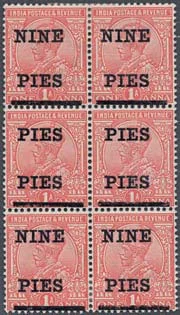
| NINE NINE / PIES PIES | Repeated word in the surcharge | The right base stamp, the setting and the provenance |
Surcharge errors and trial material
The NINE NINE and PIES PIES forms of the 1921 NINE PIES provisional are recorded errors; recognising them begins with the right one-anna stamp and the right arrangement of the surcharge. The official rupee programme of 1925 adds trials that were not adopted, adopted settings and the Two Rupees on the wrong King described by Giles. These categories are not interchangeable just because something has been printed on an older stamp.[5][3][6]
Giles’s account shows how a classification can stay unsettled even with letters from the Royal Collection: he discussed whether the known preparations numbered thirty-two or thirty-three, depending partly on whether one difference in spacing was a separate trial or an accident in one pane. A trial called scarce in 1962 is not thereby unique today, and an old illustration is not a modern certificate.[5][3][6]
The block shown here is a useful comparison: the upper and lower pairs read NINE over PIES, while the middle pair repeats PIES. The joined multiple keeps those relationships, which a single unusual stamp cannot prove on its own.[5][3][6]
Flaws in the pictorials, poor impressions, and limits
The air mail and commemorative stamps give more to look for. Keppel records an extra serif and a missing treetop on the 8 annas air mail, and Lawrence and Northam report a double picture on the ½ anna Jubilee. They also describe ordinary poor impressions on the New Delhi issue, and a reported grey 2 annas air mail that they had not seen themselves. How sure each writer was should travel with each claim.[2][3]
In a specialised collection, keep normal comparison copies, marginal pieces and dated uses beside the striking variety. A clear photograph and a plain account of why a feature comes from the printing are worth more than a confident rarity label the stamp itself does not support.[2][3]
Sources
- [1] Indian Posts and Telegraphs Department, India Postage Stamp Centenary 1854–1954: Souvenir Album (1 October 1954), plates 7–17 and printed commentary pp.2–4.
- [2] Ian Lawrence and W. H. Northam, “India: A Study of the Nasik Printings”, The Stamp Magazine, July 1942, pp.206–207.
- [3] Adrian Keppel, “Emperor of India: India 1910–36”, Stamp Magazine, June 2010, pp.42–47.
- [4] Geoffrey Clarke, The Post Office of India and Its Story (London, 1921), chapter XIX, “Indian Postage Stamps”, pp. 183–184.
- [5] D. Hammond Giles, Essays of the India Provisionals of 1925, Philatelic Society of India, Bombay, 1962.
- [6] Auktionshaus Christoph Gärtner, India: Park Collection, 7 March 2011, lot 191, photograph printed p. 29, description printed p. 72.
Notes 0
Add what you know: a cover or stamp in your collection, a date or source, a correction or a question.
No notes yet.
Sign in to add a note.
Notes show straight away. Keep them kind and about the article; anyone can report one that isn't. House rules
